DAILY DIRT: Let’s go, Honkers! Keep your heads up, Witches! Beetdiggers rock!
Daily Dirt for Thursday, Sept. 1, 2022
How did geese get to California? … Welcome to today’s three thoughts that make up Vol. 385 of The Daily Dirt.
1. Thankfully, high school sports are back (man, it was a long summer!), which brings us to another edition of best — or worst, depending on your point of view — prep nicknames.
Here are our latest finds:
Gold medal: Yuba City (Calif.) High School Honkers. It’s some sort of tie-in with Geese. I didn’t even realize there were geese in California.
Silver medal: The Brewer High Witches are the pride of Brewer, Maine. The actual origin of the nickname is unknown. “People just started using it (in the 1930s),” according to a local historian.
Bronze medal: The Jordan Beetdiggers call Sandy, Utah home. At one time, Sugar beet farming was a major industry in that area. I really have no idea what a sugar beet even is.
2. Today’s little-known fact from pop music history:
The record for most weeks a song spent on the Billboard Hot 100 belongs to Imagine Dragons’ “Radioactive.” The song charted for 87 consecutive weeks, ending its run in 2011.
3. This week’s MLB rankings deal with the best and worst logos of the 30 big-league teams:
The best
1. St. Louis Cardinals: I’ve always loved the StL on the caps. Coupled with the Birds on the Bat on the front of the uniforms, there’s no franchise close to J. Robert Gough’s favorite team when it comes to this part of the game.
2. New York Mets: The Mets’ old-English “NY” crest is much sharper than the similar deign of the rival Yankees. The Mets’ circular crest with the cursive “Mets” in front of the New York City outline is also impressive. The Mets’ uniforms were originally designed to incorporate tributes to both the New York Giants and Brooklyn Dodgers, whose departure to the west coast ultimately helped give birth to the Mets.
3. Toronto Blue Jays: That is one sharp bird on the Blue Jays’ caps and uniforms. The splash of red is the perfect accent. The Wilson font the team utilizes is another plus in the Jays’ overall look.
4. Milwaukee Brewers: The “m” and “b” together on the caps, forming what appears to be a glove, is pure quality. It’s also one of the most distinctive looks in MLB.
5. Baltimore Orioles: Who doesn’t love a smiling bird?
The worst
1. Cleveland Guardians: The ridiculous winged “G” is as bad as the new nickname, and even worse than the equally ridiculous New York Mets’ “Mr. Met” look from years ago. Please come home, Chief Wahoo. Please.
2. Tampa Bay Rays: Since its inception, Tampa Bay has always been a team without any sort of definitive look. From the juvenile “TB” on their caps to what I suppose is a manta ray on some of its uniform combinations, Tampa Bay’s alleged ‘look” is a disaster.
3. Detroit Tigers: Old-fashioned and boring. Tiger fans point to the look as “traditional.” Well, maybe it’s traditionally boring.
4. New York Yankees: A makeover has been long overdue in Gotham. Long, long overdue.

5. Seattle Mariners: From whatever exactly Seattle’s team colors are supposed to be, to its uniforms’ overall tedious appearance, the Mariners’ look is the equivalent of a yawn.
Steve Thought O’ The Day — I have never heard “Radioactive.” I’m not even sure I have heard any other Imagine Dragons song in my entire life.
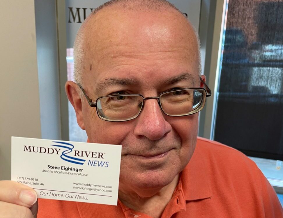
Steve Eighinger writes daily for Muddy River News. How many good takes and bad takes can one man fit into a column?
Miss Clipping Out Stories to Save for Later?
Click the Purchase Story button below to order a print of this story. We will print it for you on matte photo paper to keep forever.
